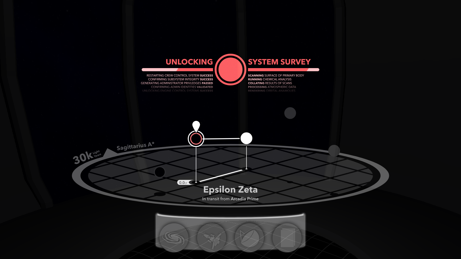
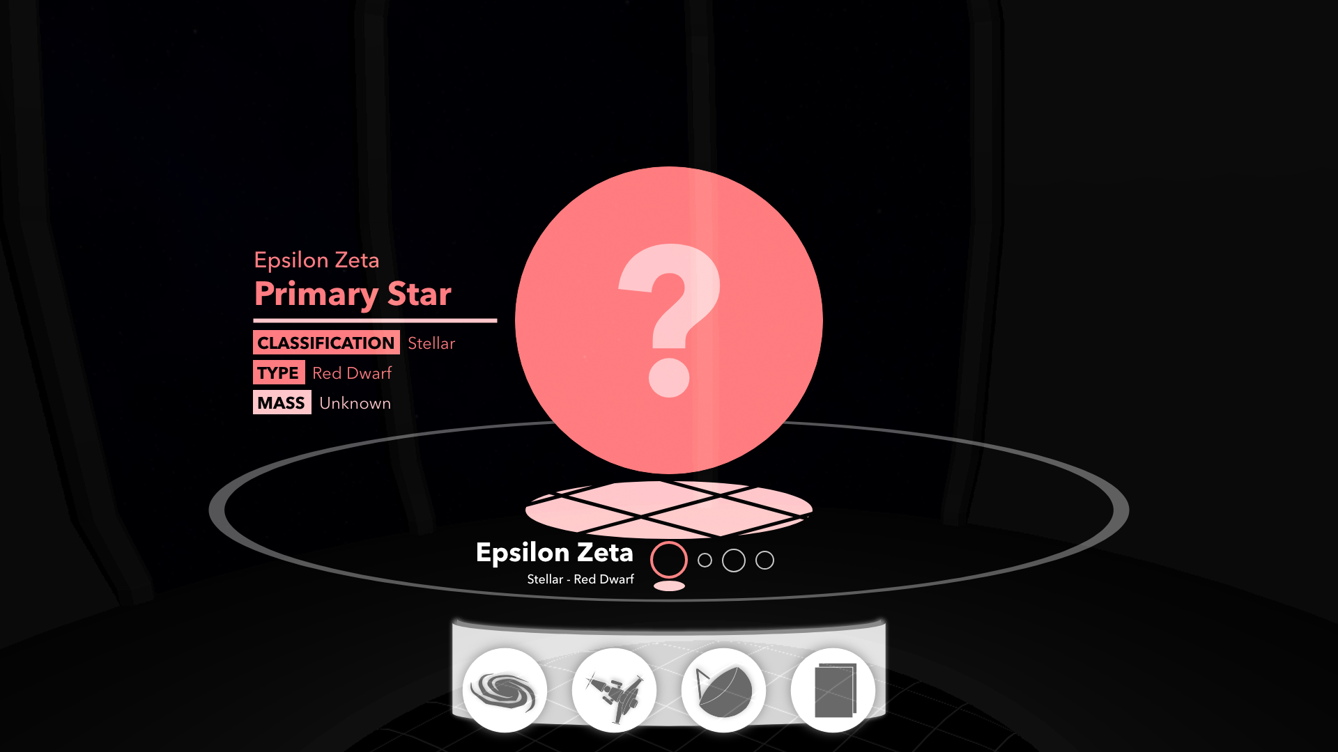
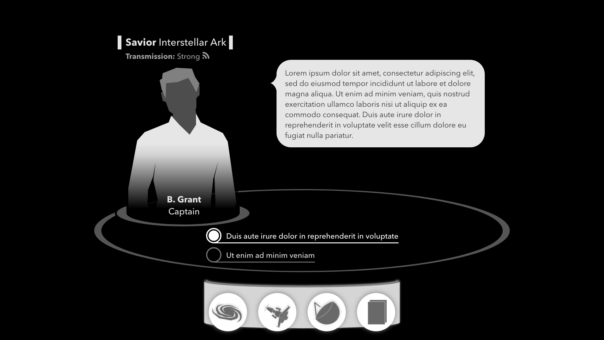
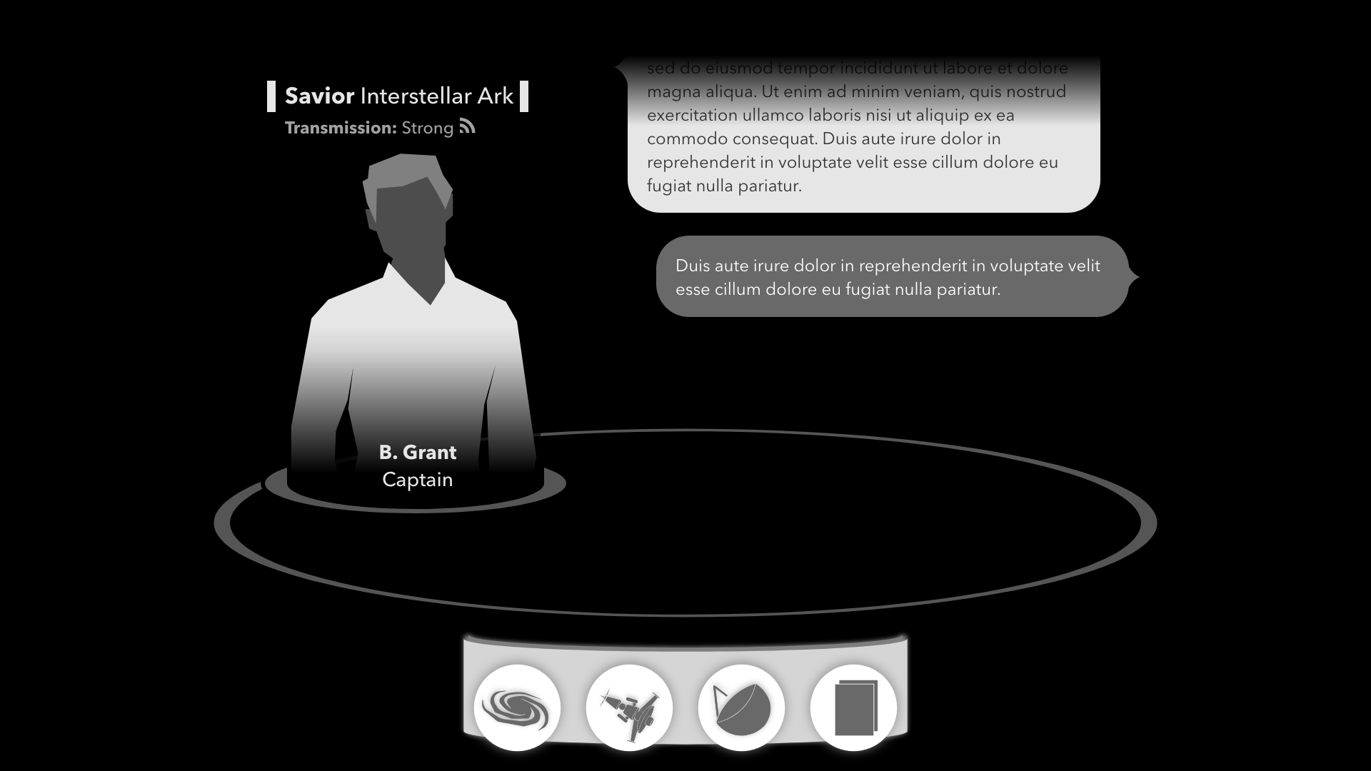
Having completed SubLight’s navigation system, I thought I’d take a moment and reflect on how I created its visual language. Most importantly…
How did the design of SubLight’s interface go from this,
To an implementation like this?
The Prototype
I started off with a top-down view for navigation in SubLight’s prototype.
It was a raw, ugly prototype. What I disliked the most though was the vantage point. I wanted SubLight to have an air of realism, believability. I knew I’d have to find something better than the typical bird’s eye view.
Finding an Aesthetic
I created design pillars for my interface, and since SubLight is so interface heavy, these extended to be pillars for most of the game’s interactions.
- Diegetic
- All interfaces should exist in the world of SubLight. There shouldn’t be a 4th wall, the player should be reaching in and touching the actual interfaces of their ark when they play SubLight
- Avoid Visual Noise
- If anything can be tucked away behind another menu, it should be. If an icon can be minimized or hidden, it should be. Only data relevant to the user at that very moment should be shown.
- Juicy
- It should feel rewarding to explore the interface, open drop-downs, and highlight items. Attractive animations should take the place of anything that would normally be instantaneous.
While SubLight is not a VR or AR title, my time working in those fields has influenced my design philosophy. I wanted a diegetic interface, one that exists in the world and not just for the user playing the game. This was doubly important since most of the action in the game would be presented through the interface alone. Avoiding a game that feels like it’s “all menus” while making a game that is “all menus” was the goal.
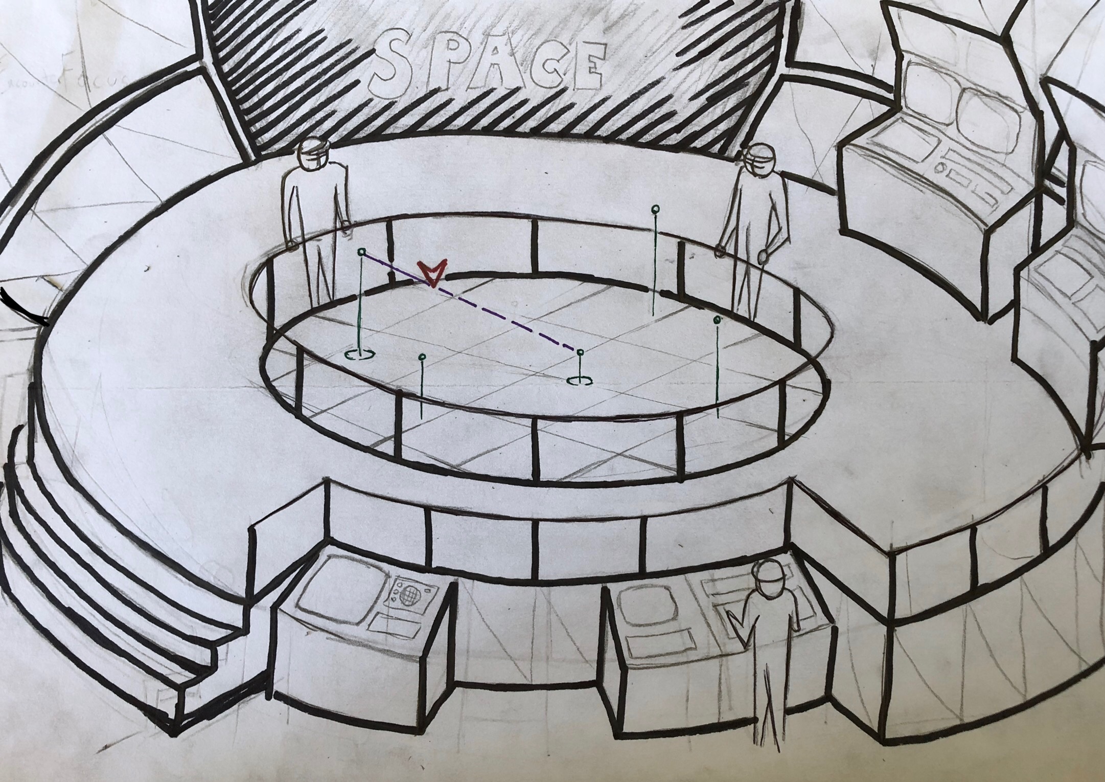
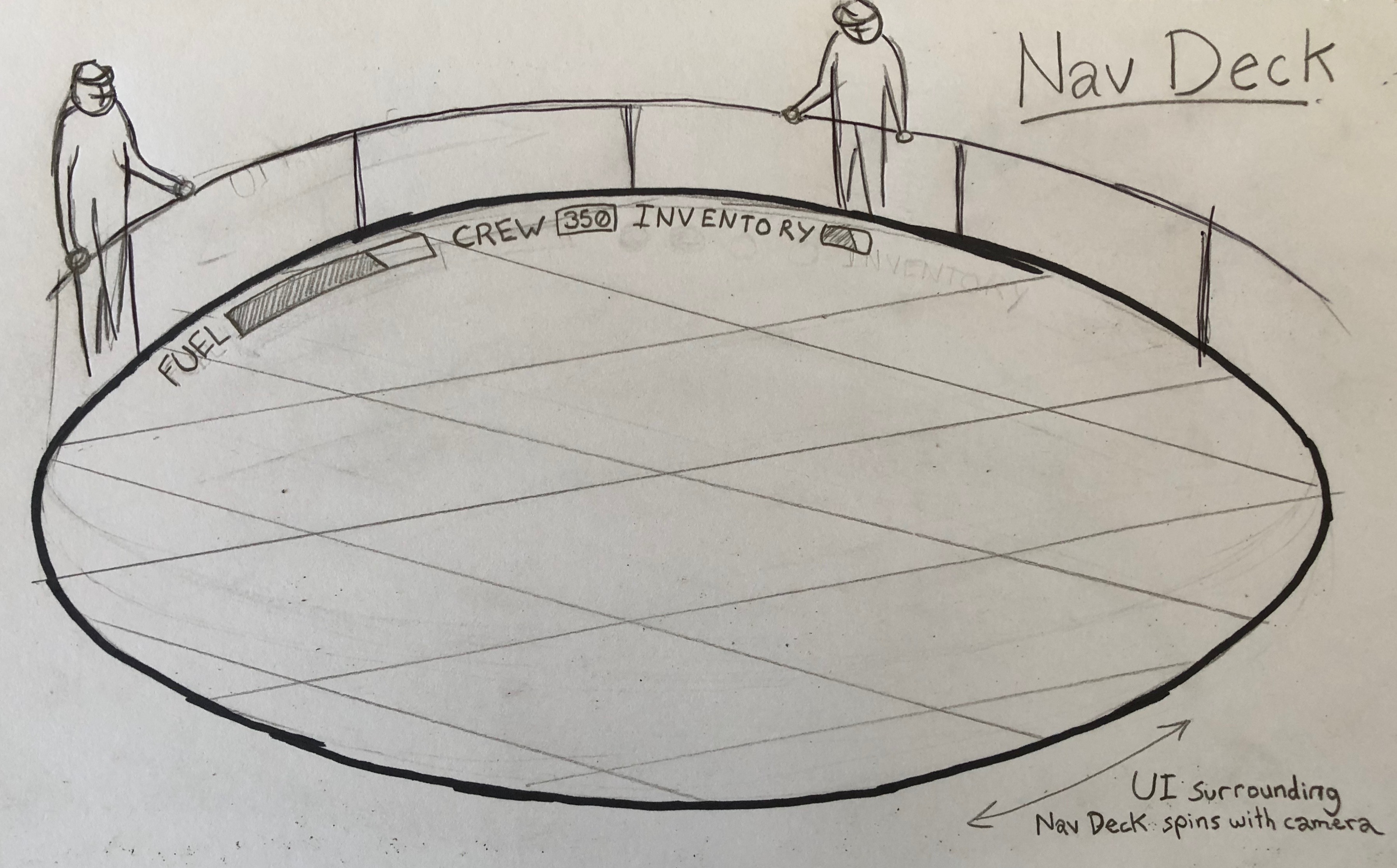
The idea for presenting SubLight’s gameplay crystalized in two simple sketches.
I wanted to create a “holographic pool” that would project the navigation view. Initially, the computer consoles on the pool’s circumference would serve as additional interfaces for SubLight, such as ark management, main menu, settings, and so on. Ultimately, I decided to use the central holographic pool for all interactions.
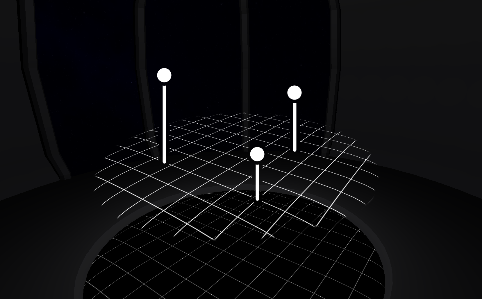
A high contrast holographic foreground and dim background would be essential. I created a proof of concept with Blender and Photoshop, something basic to see how it would feel.
This immediately felt promising.
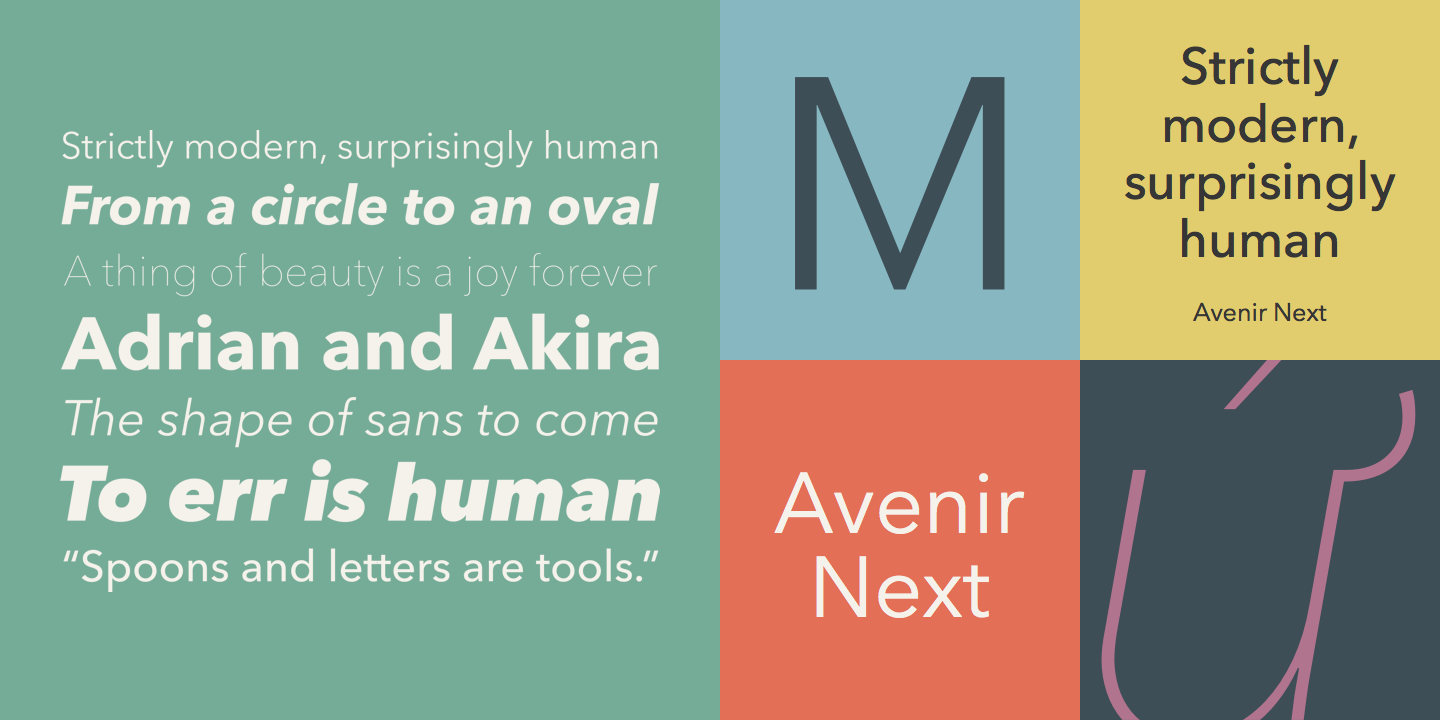
As a fan of typography, I found it inspiring to pick a font to work around. I knew I wanted a lot of circles and roundness to my interface, so I chose Avenir Next. I was also drawn by the many attractive weights it was available in.
Creating a User Experience (UX)
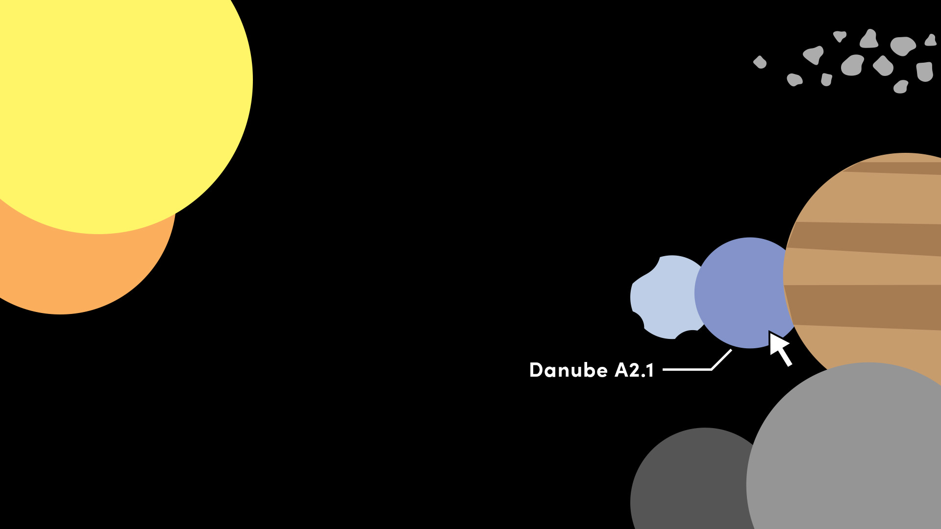
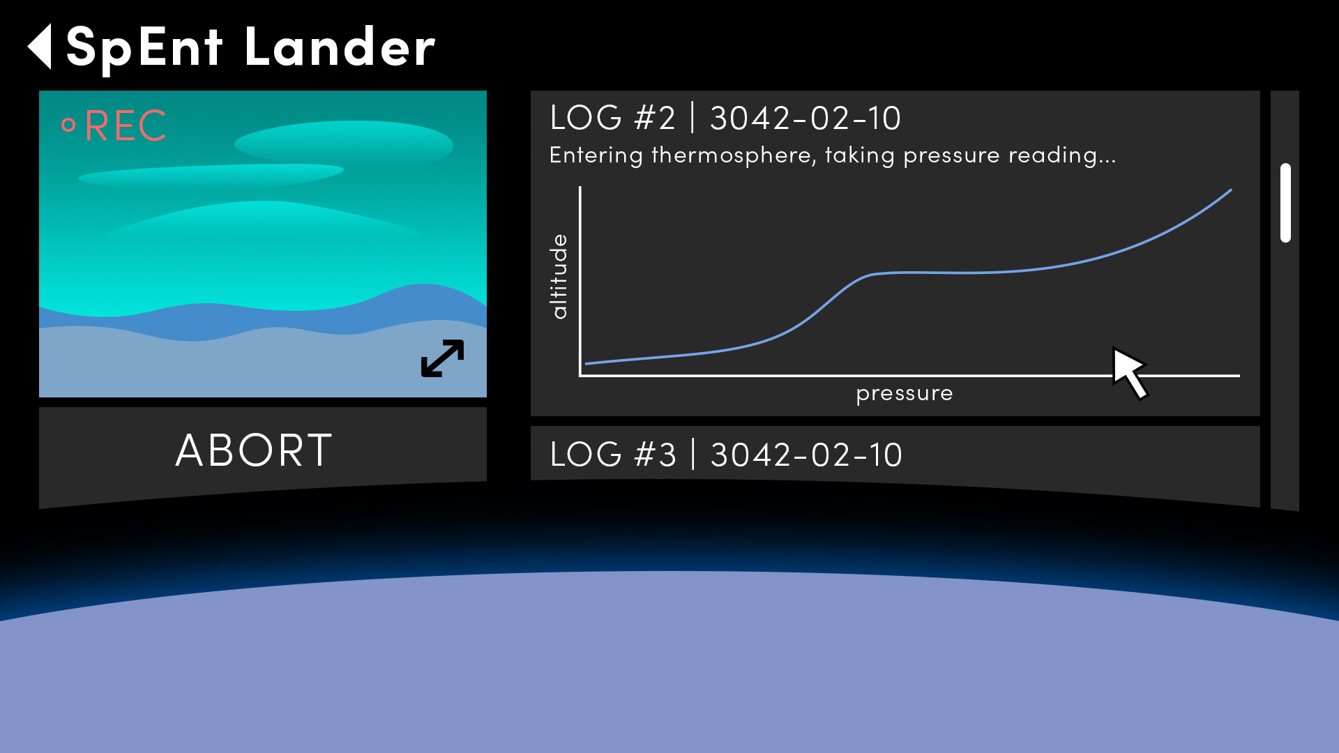
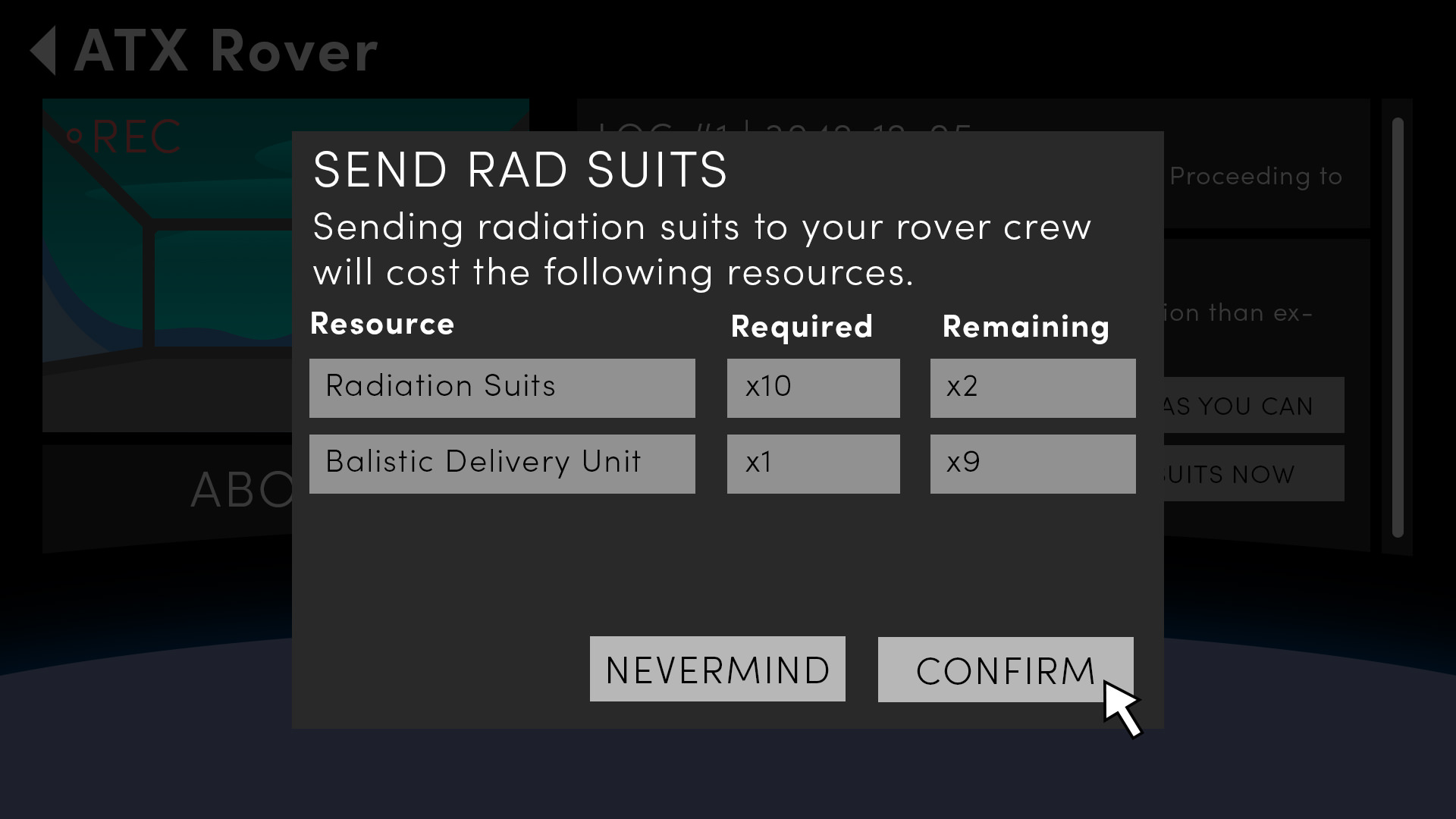
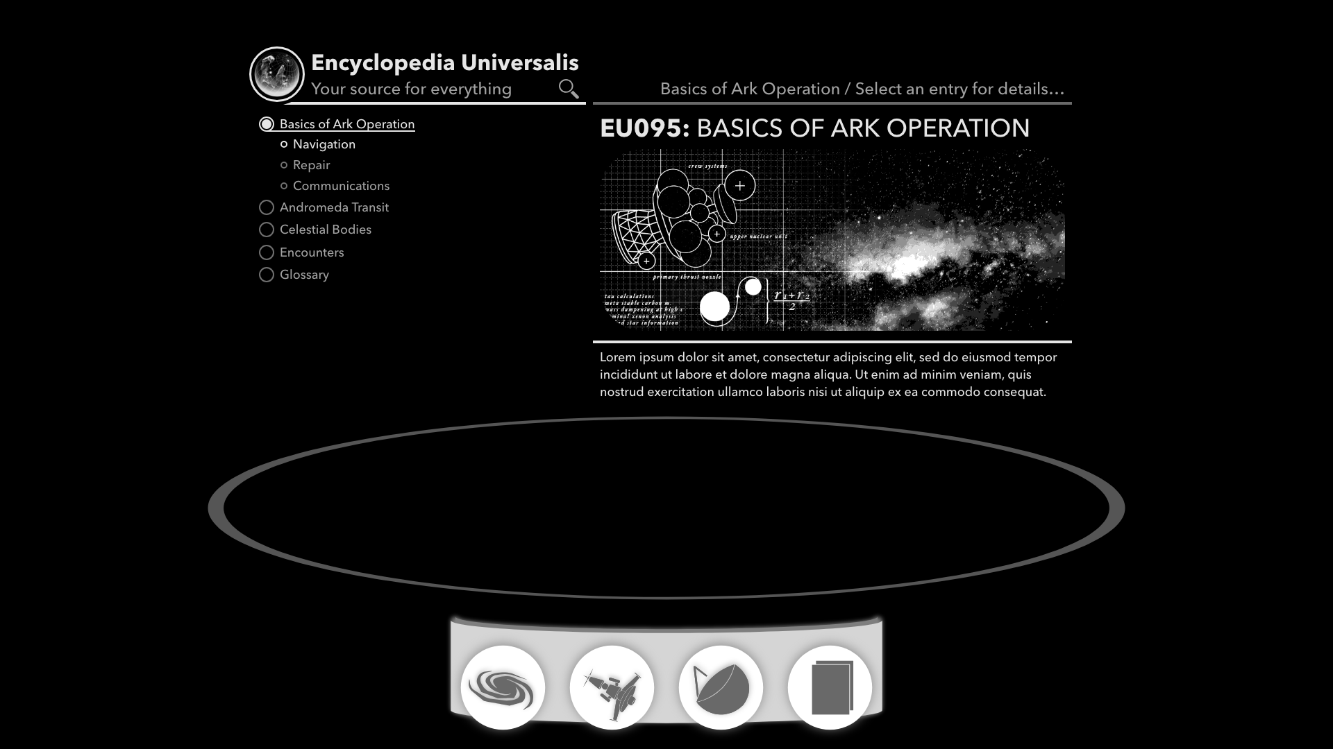
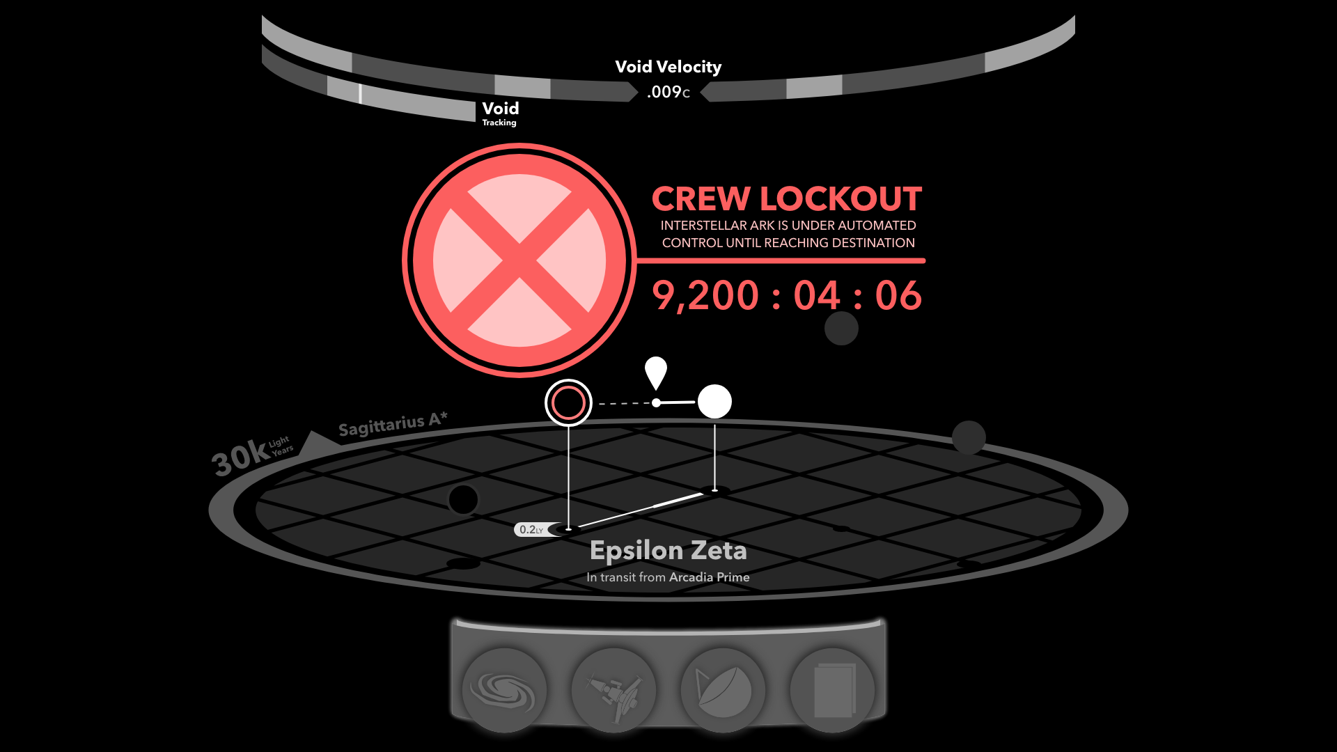
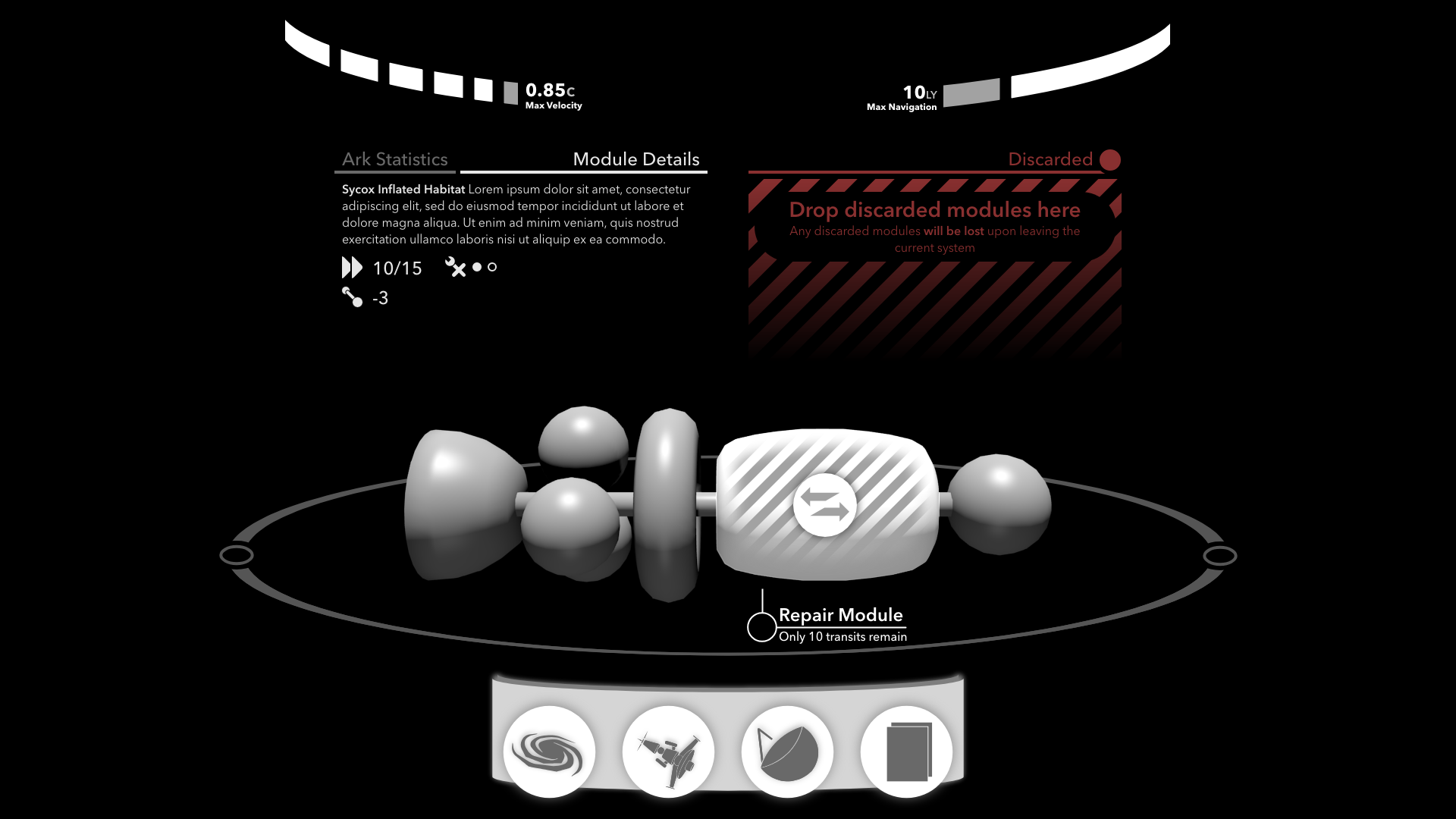
Using Adobe XD, a tool new to me, I created the UX for all playable aspects of the game I could think of. This required a few weeks of iteration, but it was worth it to have a robust set of designs.
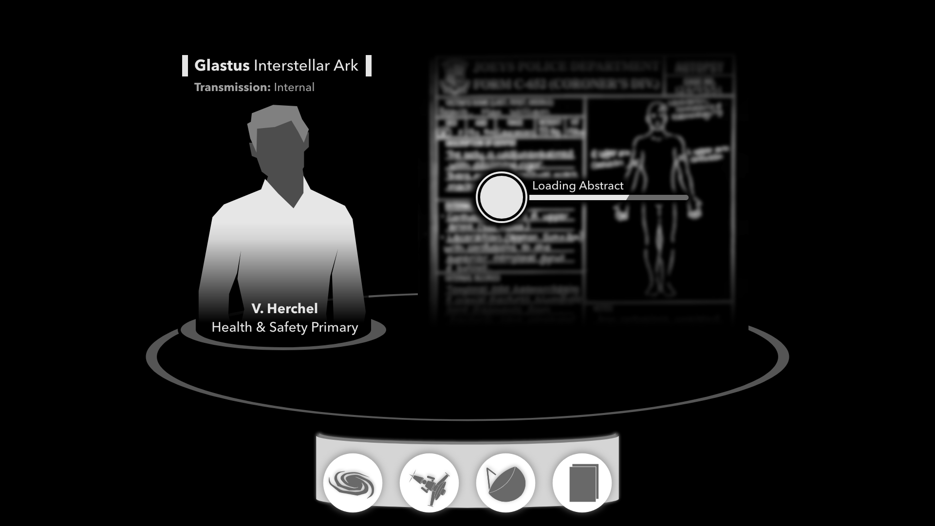
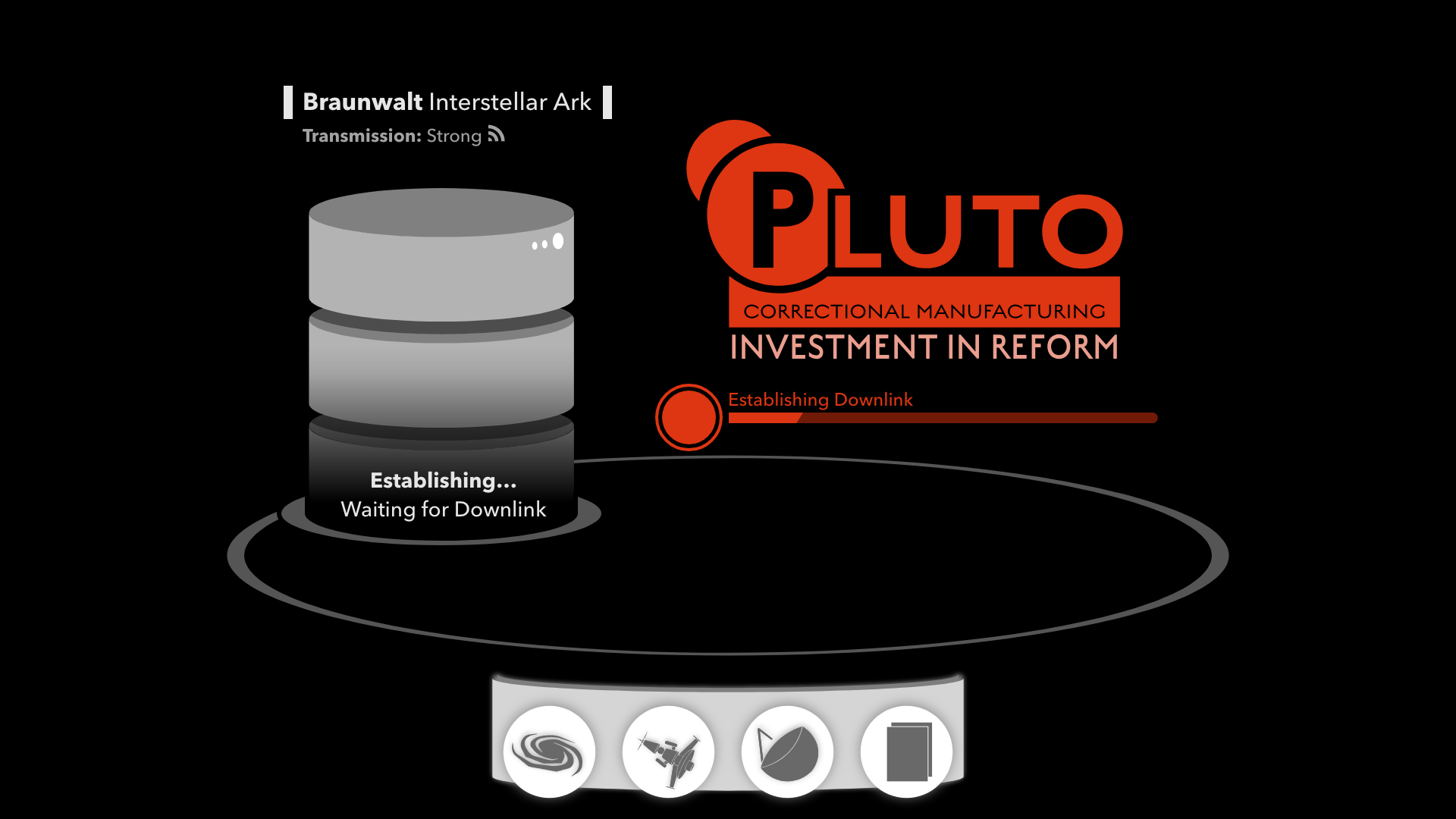
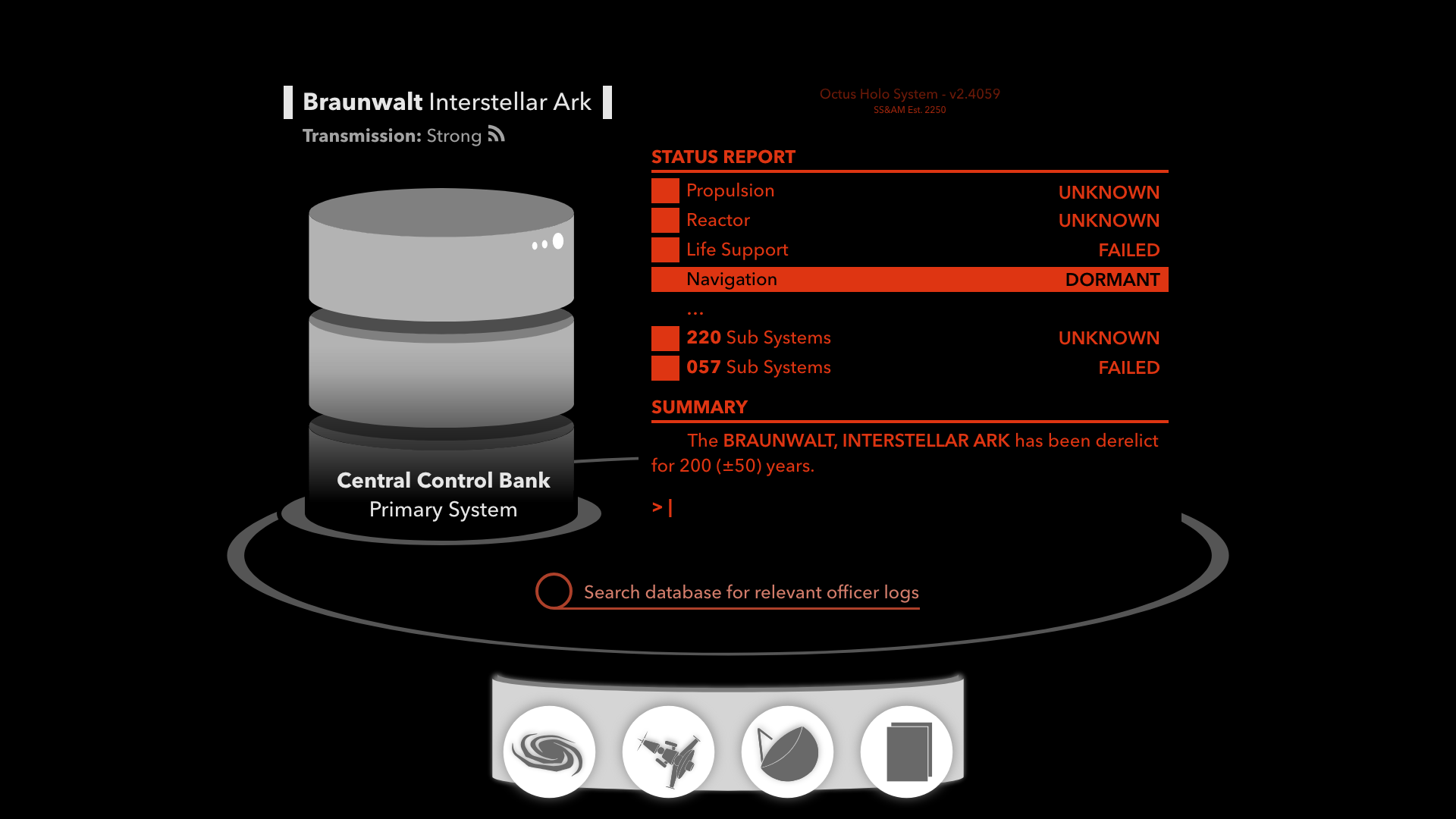
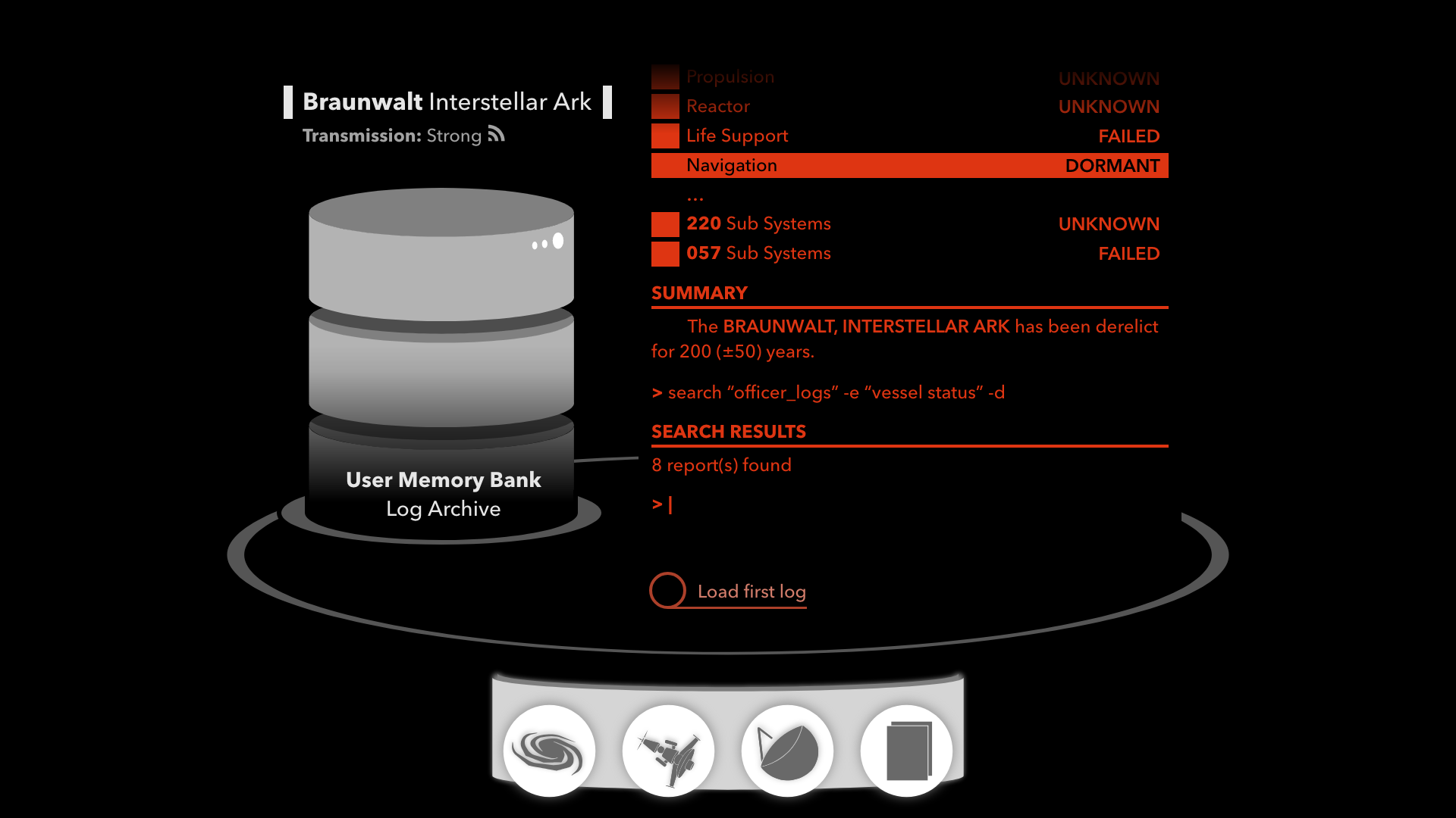
Samples from SubLight’s 160+ page UX document
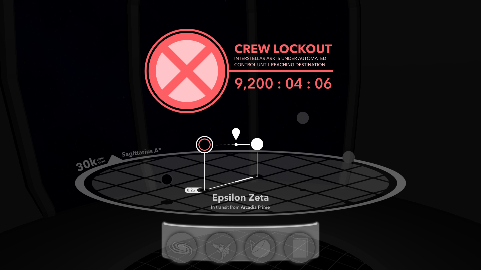
I added these designs to my example scene in blender, and they still felt right with the ark’s control room in the background.
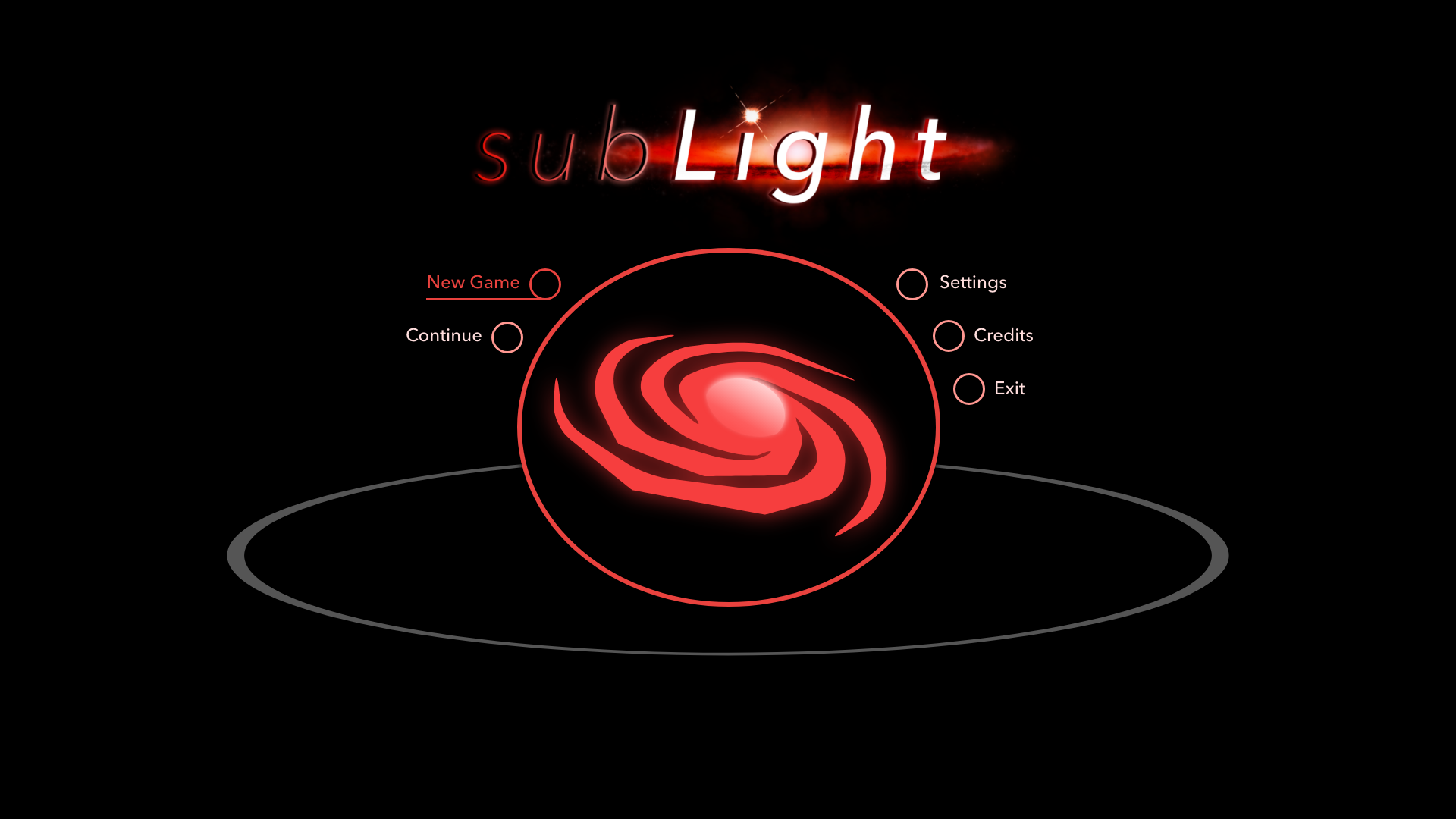
While the main menu was low priority, working on it first let me experiment with getting a feel for this unique interface.
Implementing dialogs was a great example of how various interfaces would be “dimmed” to focus something in the foreground.
Scale Carefully
The navigation view took several months, mostly iterating on controls and how zooming between various levels of detail would work. I knew early on I wanted to keep a realistic scale for SubLight’s galaxy, which was to be a stylized version of our own Milky Way. I figured zooming smoothly like Google Maps, with one level of detail slowly transforming into another, would feel good. I was wrong, very wrong.
It’s one thing to say space is big… it’s quite another to try and show it all. Zooming out from local star systems to the local cluster of galaxies is extremely tedious, there’s simply no great way to preserve the feeling of scale while doing this. I tried making the speed at which you zoom change over time, but that didn’t feel right either. Even defining various “steps” that the level of zoom would drift to when zooming stopped felt wrong. These all seemed to take away control of the zooming from the player.
Turns out the simplest solution was the best. I defined several levels of zoom the navigation view looked good at, and immediately zoomed the player to it when they scrolled up or down. The player now felt like they were scrolling between levels of zoom, instead of having control taken away from them while zooming. In the future I’d like to replace the level of zoom above local systems with another view showing faraway systems of interest, but for now this is very functional.
Transit Between Systems
The most challenging aspect of the navigation view was the many selection and highlight states, some of which I had to cut and save for a future pass at the navigation view. Breaking the views up into discrete states helped manage complexity. I could then animate these elements based on their selection, highlighting, visitation, range, and classification.
Once selected, a system can be clicked on again to initiate a transit to that system. Normally your travels will be interrupted by unique events, which you’ll interact with in a separate communications view. For now, here’s a video of the transit animation.
I think this transit portion of the game will evolve over time as more detail is added to the ark’s control room. I’d love to make the holographic display flicker in and out, the windows dust up, and have blurs of crew members swirl by as the centuries are ticked off by the ship’s chronometer.
What’s Next?
The initial prototype had a functional encounter system, with support for branching dialogues and so on. My goal is to create that system in the new aesthetic I developed for the navigation view. Here’s some samples from the UX document I’ll be working from.
There’s many more design and gameplay decisions I made over the last six months of development I’d love to talk about, but those will have to wait for future blog posts!
